When Coastal Distillery wanted to import and bottle Missouri Ridge Single Barrel Bourbon for the European market, the company decided it needed a label to truly reflect the premium quality of the liquor and its heritage. They turned to Tom Lane of Ginger Monkey Design and he called on me to help with the concept development and copywriting. It turned out to be an exciting branding project. Working with great clients and collaborating with someone as talented as Tom was a real pleasure, and I couldn’t be prouder of the outcome.
All we had at the beginning was a little bit of information about Missouri Ridge Distillery and its founder M Gregory Pope, and from there the challenge was to build a coherent concept and narrative around the product. Our story centred on M Gregory Pope, his distilling skills and his heritage. The grandson of a moonshiner, he uses old family recipes to make his craft liquors but has also developed modern techniques and designed a unique copper still system. Researching the distillery, its locality near Branson, Missouri, and the state’s Ozark Mountain culture, I built up four main conceptual themes for Tom to take to the client along with potential visual approaches.
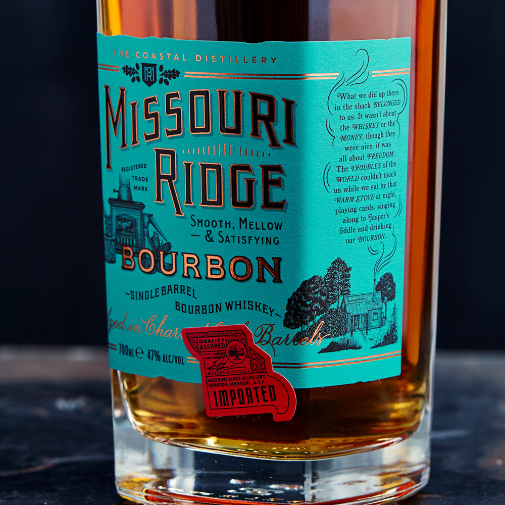
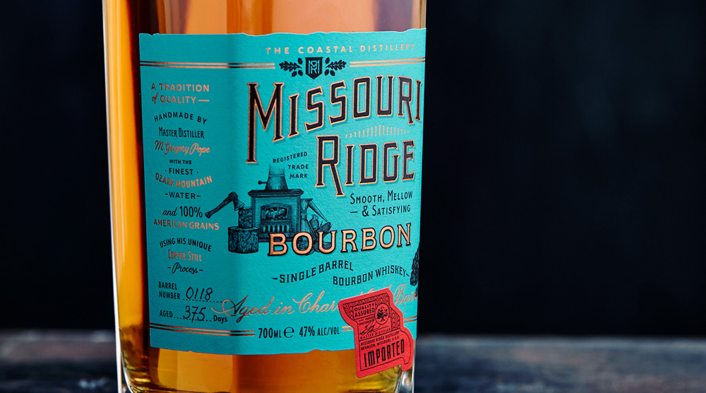
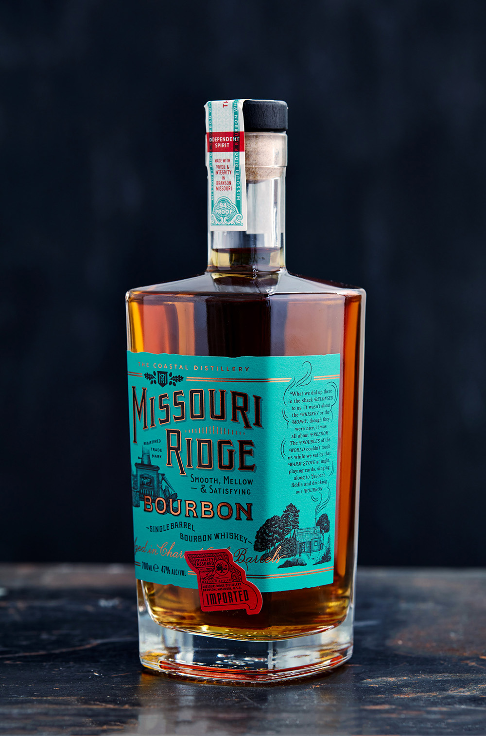
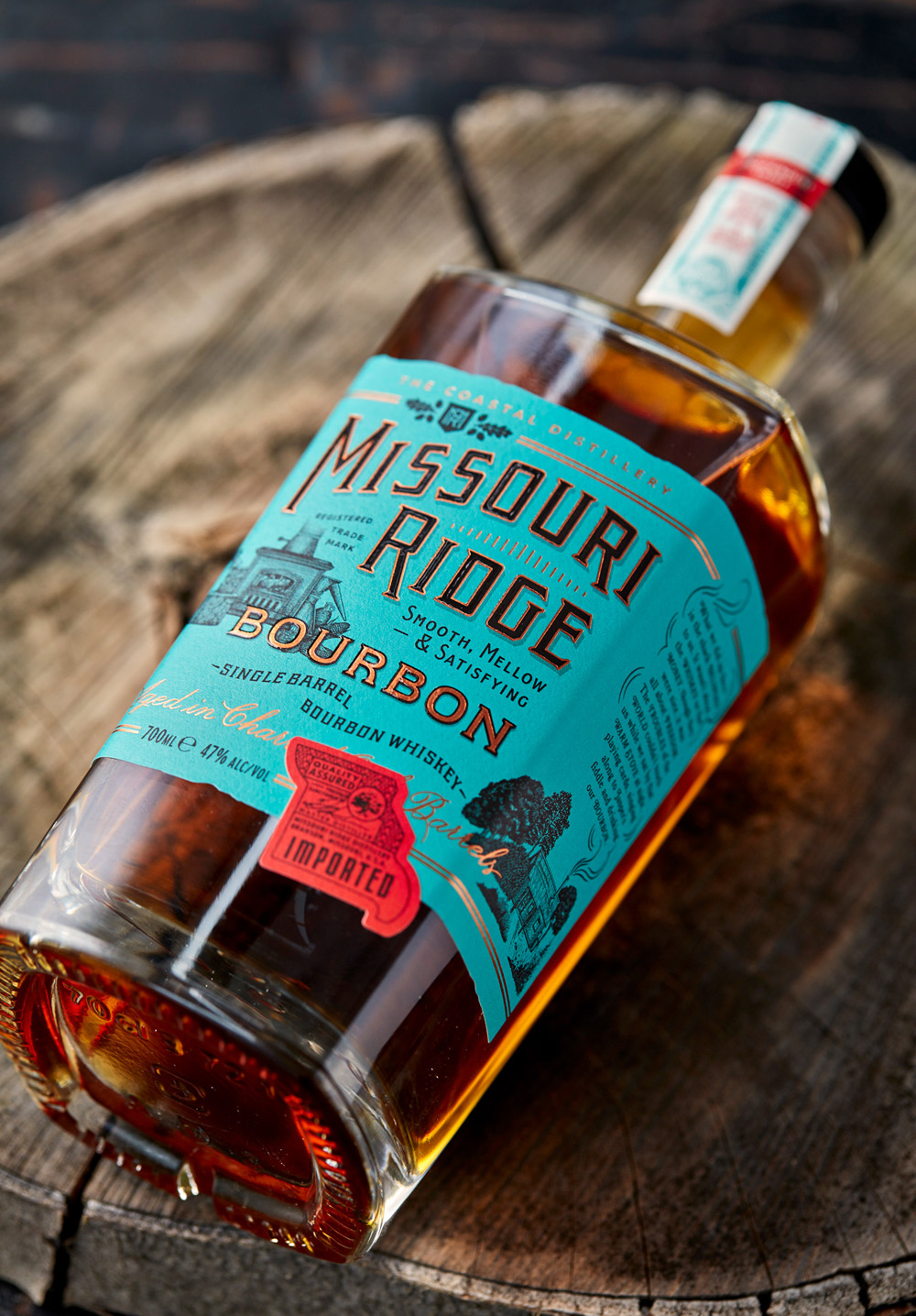
Because M Gregory Pope’s grandfather used a wood burning stove to heat his still back in the day, we used this image as the basis for several of our ideas – it’s something that a moonshiner would use, and it symbolises independent living and the spirit of freedom associated with life in the Ozarks. It might be a slightly strange image to use on a bottle label, but bringing it together with his hand-drawn lettering, an old fashioned sign writing style of presentation and an illustration of a moonshiner’s cabin, Tom developed a highly individual label scheme for the bottle. We worked hard on the information hierarchy on the label, with positions for the product name (obviously), a flavour note and core information about the ingredients and distilling process used.
The green colouration, based on the copper carbonate/sulphate patina that forms on old copper roofs, came out of the concept work I did early on, tying the label in with M Gregory Pope’s unique copper still system, which gives the bourbon its smooth flavour. Copper foil text on the label continues this theme and brings a premium feel. Meanwhile, down the right side of a label is a short narrative piece I wrote, which appears in the smoke rising from the cabin giving the product an emotional dimension by evoking the moonshiner experience.
I was really pleased when I found out that our client Alex Hull at Coastal Distillery believed the quotation on the bottle was genuine: “We were thrilled by the inclusion of an earnest quote from a 1920s moonshiner, rising as smoke from the wooden cabin. When Tom told me that Garrick had created this for the project I was stunned. I really thought it was a quote from 100 years ago. A vital and personal touch to the whole feel.”
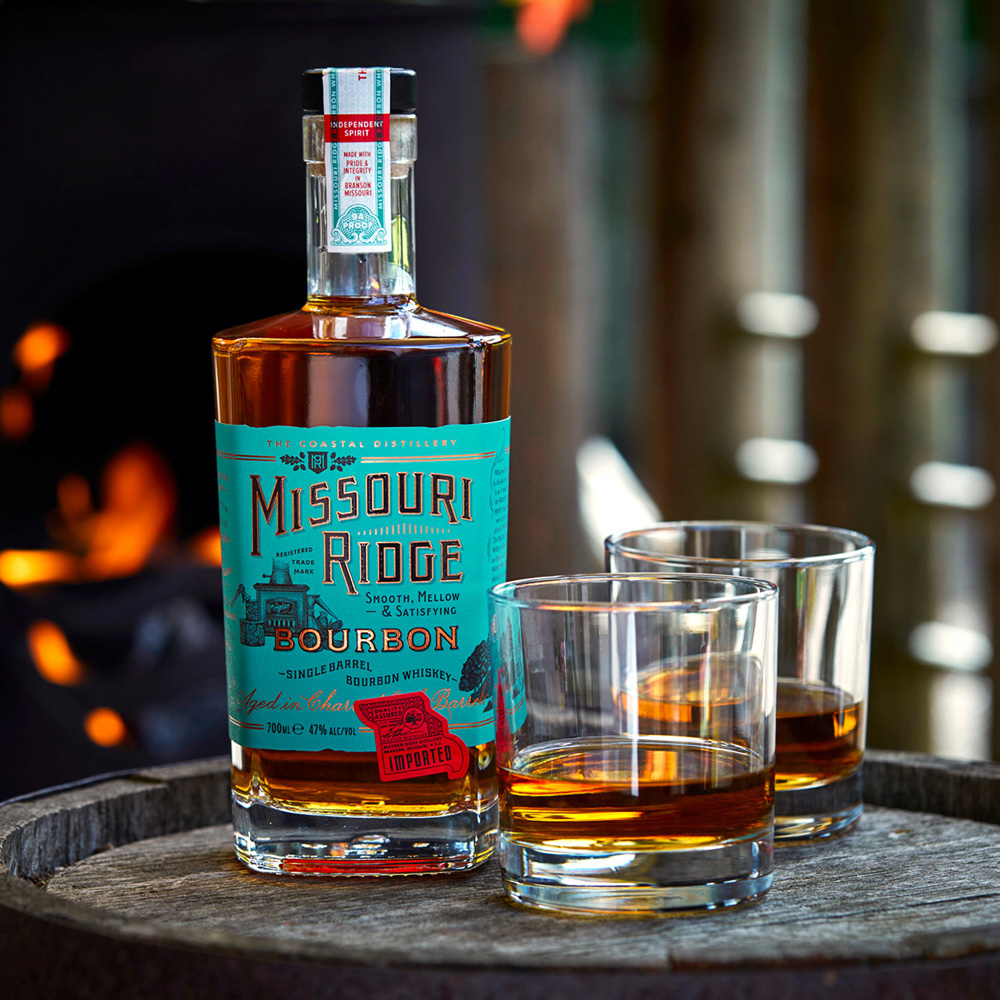
To round off that perfect atmosphere Tom had the photography done in an old wooden cabin with a wood stove burning in the background. We can’t wait for people to taste this luxury spirit, and we’re looking forward to more projects like Missouri Ridge. Tom and I have recently started working on the branding for a new craft distiller, so watch this space.