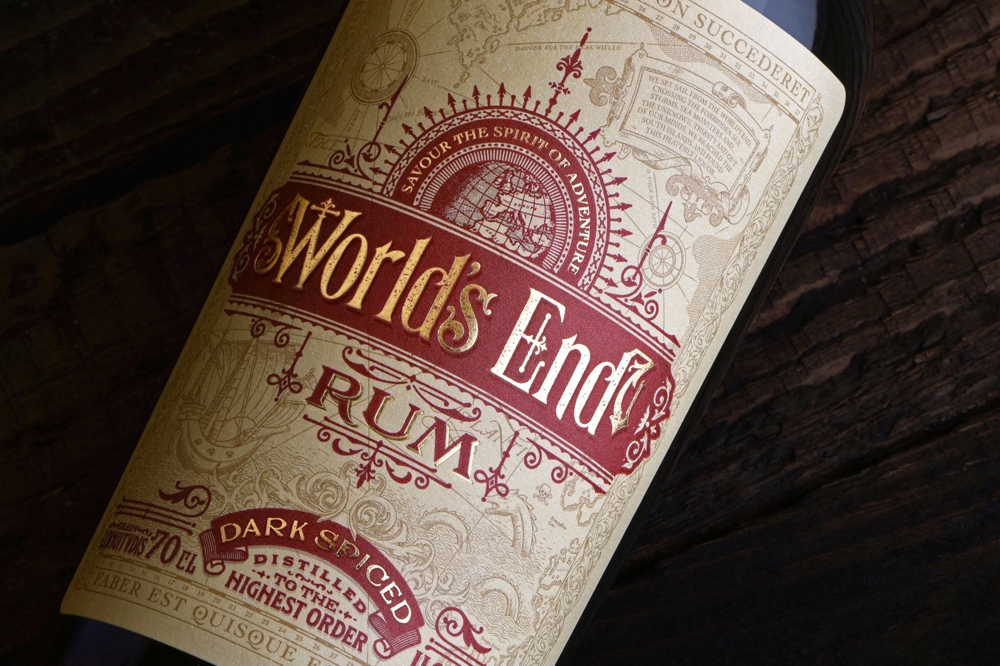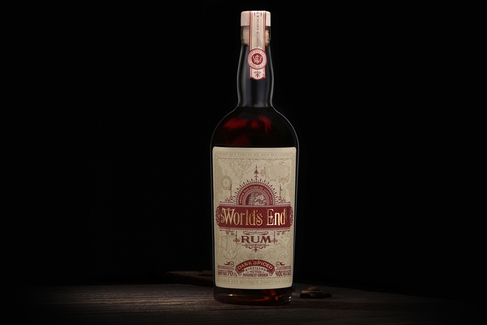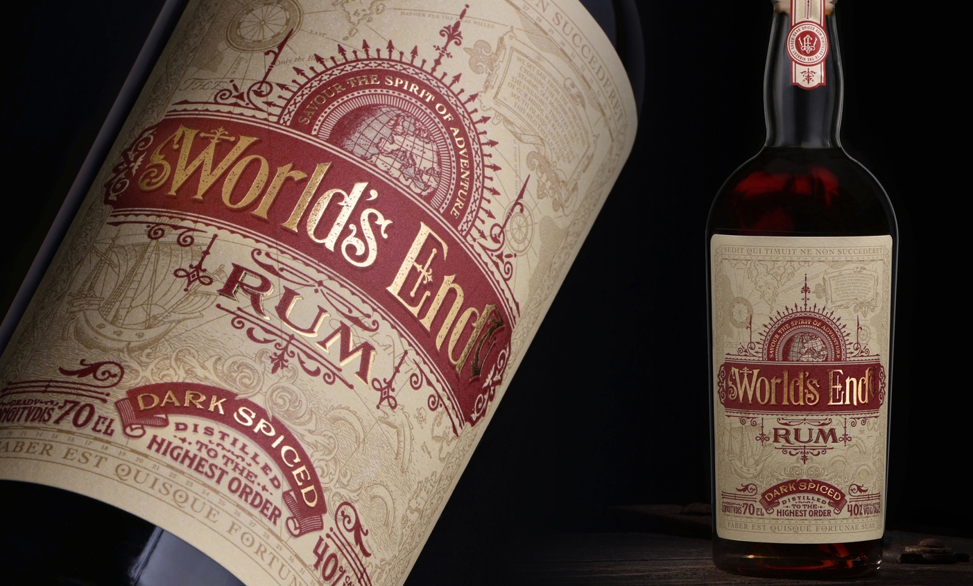
Premium alcohol products come in fascinating packaging, and I often find the detail in the artwork and the messaging very inspiring. The challenge is to draw the purchaser into a narrative and an atmosphere that represents the drink, capturing their imagination and hinting at the flavour at the same time. That was the underlying brief on this project, which I worked on with Ginger Monkey Design.
 The World’s End Rum brand takes as its starting point Cape Sagres, on the southwest tip of Portugal. During the Age of Exploration, Europeans considered it to be the world’s end. To add a little character to the company’s first product, this dark spiced rum, we invented a 16th century navigator called Nathaniel Winter whose mission it would be to explore the high seas discovering new flavours and fine alcoholic drinks. Looking at the designs Tom Lane at Ginger Monkey was working on, I built up the concept around this character and started writing little segments of his story that could go on the bottle labels.
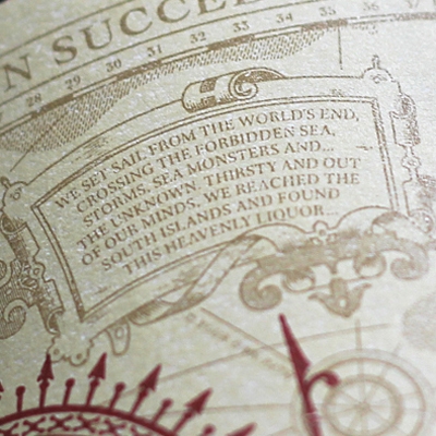
We proposed this to the client, aiming to generate branding that offered something rhythmic, nautical, nostalgic and with a hint of luxury. Nathaniel’s adventures are fun, and a little far-fetched, as his story goes on. The first bottle displays a legend top right which wraps up Nathaniel’s discovery of this dark rum in a lighthearted way. It’s something for the drinker to discover and ponder, and look for again when they try another flavour in future.
Space was limited, and the final text was carefully honed.
“We set sail from the World’s End, crossing the forbidden sea, storms, sea monsters and… the unknown. Thirsty and out of our minds we reached the south islands and found this heavenly liquor.”
A few more flavours are planned, as far as I know, but we’ll have to wait and see. Hopefully I’ll be able to reveal more of Nathaniel’s story soon. It wasn’t a huge job, but the gold-foiled label looks beautiful, doesn’t it?

